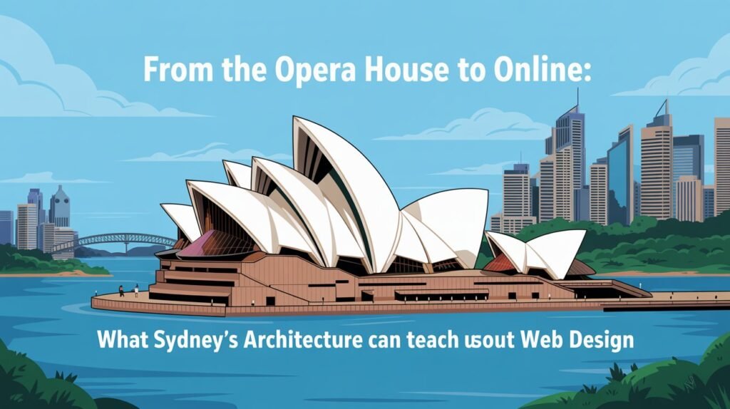
Sydney doesn’t tiptoe when it comes to design. It makes statements. Bold ones. Think about the Opera House—those sails cutting into the skyline like nothing else in the world. Or the Harbour Bridge, unapologetically massive, yet elegant in its own right. Even the mix of old sandstone buildings in The Rocks alongside the shiny towers of Barangaroo is notable. It’s a city that plays with contrast, scale, and daring ideas.
Funny thing is, the same lessons echo in the digital world. Web design in Sydney isn’t just about pixels on a screen—it’s architecture, just on a different canvas. A website is a kind of building. Not made of steel or concrete, but it still has to stand, welcome people in, and leave an impression strong enough that they want to return.
Bold Doesn’t Mean Reckless
The Opera House wasn’t safe. It was radical. And for years, plenty of people thought it was too out there. Now? It’s the icon of a nation. That’s the risk and reward of bold design—it divides at first, then defines.
Web design in Sydney takes a note from that playbook. Being bold matters. But bold doesn’t mean messy or confusing. Just like the Opera House still functions as a performance space (and a brilliant one at that), your website still needs to perform the basics flawlessly. Navigation, accessibility, clear pathways. Without those, boldness just becomes noise.
So the trick is this: let your website stand out, but don’t let it trip up the people trying to use it.
Old Meets New
Stroll through Circular Quay and you can’t miss it—stone walls from another century standing shoulder-to-shoulder with slick glass towers. The city doesn’t bulldoze its past. It stacks it, blends it, lets the old and new argue a little before settling into harmony. That tension is what makes Sydney’s skyline hum.
Web design in Sydney borrows from the same playbook. Some businesses wear their heritage proudly—family-run shops, institutions that have been around longer than the Harbour Bridge. Others? They’re startups that barely existed last week, built on caffeine and ambition. Both have their place.
The real magic happens when a website doesn’t choose sides, when it nods to the roots but still feels fresh. A typeface that whispers tradition, paired with a layout that screams modern. Colours that echo the past, anchored in a design that moves like the present. It’s not about clinging to what was or chasing whatever’s shiny today. It’s about letting both sit at the same table, share a drink, and tell a richer story together.
Function First, Always
The Harbour Bridge is stunning, but its purpose is practical. It connects. It carries thousands of cars, bikes, and people every day. Its beauty is in its strength, not just its curves.
Websites should work like that, too. A good site isn’t just pretty; it works hard behind the scenes. Pages load quickly. The mobile version doesn’t break when someone’s checking it on a train rattling through Redfern. Information is easy to find without three dead-end clicks.
When businesses invest in professional web design in Sydney, they’re really investing in function. Because in a city where everyone’s time is precious, clunky websites don’t get second chances.
Details That Stick
Sydney has its grand icons, but ask locals what they love and you’ll hear about more minor things too. The backstreets of Newtown, murals tucked into alleyways, and fairy lights strung above bars in Surry Hills. Little details that feel human.
Websites need those touches as well. Maybe it’s playful microcopy. A hover effect that feels unexpected but delightful. Subtle animations that guide rather than distract. They’re not huge design statements, but they add personality—and personality builds connection. In the world of web design in Sydney, those quiet details often set one business apart from another.
Space to Breathe
Sydney can be chaotic—crowds at Bondi, traffic in the CBD—but its best spaces always leave room to breathe. Wide lawns in the Royal Botanic Gardens. Open plazas at Darling Harbour. Even the Opera House forecourt, which frames the building by giving it space.
Websites need that same breathing room. Too many cram everything above the fold, desperate to grab attention all at once. The result? Overwhelm. Visitors leave faster than they arrived. Smart web design in Sydney respects white space. It lets content breathe. It trusts that clarity is more persuasive than clutter.
Long-Term Landmarks
The Opera House wasn’t built overnight. Neither was the Harbour Bridge. Both took years—and both are still standing strong decades later. That’s the power of building for longevity.
Websites deserve the same mindset. Too many businesses treat them as one-off projects. Launch it, forget it, move on. But the real ROI of professional web design in Sydney shows up in the long term. A site that grows with your business. That adapts to new technologies without crumbling. That remains relevant not just this year, but five years from now.
Longevity beats shortcuts every time.
Wrapping It Up
Sydney teaches us that design is more than surface. It’s vision. Function. Details. Space. Culture. And when those elements come together, the result is unforgettable.
So if you’re weighing up the value of professional web design in Sydney from Make My Website, think bigger than “just a website.” Think about what the city itself has taught us. Build bold but usable. Layer history with innovation. Sweat the small stuff, but leave room to breathe. Above all, design for people—for the locals who will walk through your digital doors day after day.
Because in the end, whether it’s a building on the harbour or a website on the web, design isn’t just about looking good. It’s about lasting. And leaving people with something they’ll remember.
Want more to read? Visit dDooks.


